Developing a great logo is a mix of art, science, and psychology. Before we get started, let's review a few things about the what's, why's and how's of great logos.
Your logo is not your brand. Your logo is representative of your brand. Your logo is a visual mark. It allows people to find you, remember you and differentiate you from other businesses. Your logo design and consistent use will effect how your brand will be perceived and remembered. A great logo can give you incredible leverage and contribute directly to your bottom line.

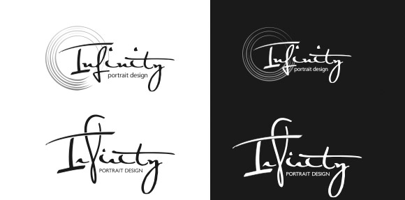
Black and White
Good logos are designed in black and white first. Color comes later.
By initially evaluating the black and white version, you get a much better idea of the shape, design and readability of the logo. Good design stands up well in black and white as well as reversed out of black or white.

Shape and Style
Logos are first recognized by shape. Good logos have unique shapes that are quickly differentiated
from the sea of other logos that the public sees every day. The shape must be simple, clean and quick
to understand. Sometimes logos are just the name of the organization in a well-selected font. And,
yes, words—all by themselves—are shapes.
Complicated logos are more difficult to recognize. People memorize logos in exactly the same way they memorize printed words. Incredibly simple, unique designs are the most effective. But they are also the most challenging to create. The shapes must be easily recognized literally in a blink of the eye.

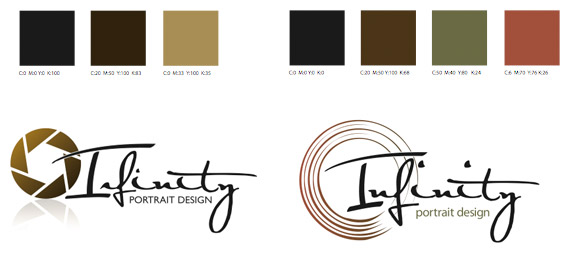
Color
Just like the shape of a logo, color needs to be simple and easy to recognize and memorize. Complicated color combinations that include lots of different colors distract from the most important element of the logo – its shape. Again, think about memorization. Narrow choices down to a select color or limited color palette. This will help insure your logo is shown consistently and is easy for people to recognize.
Sources: Adapted from research from Marketing Professionals, "Logos: What Makes Them Work" by Jared McCarthy, "All That Glitters is Not Sold" by Patricia Pao, "Increase Sales with Color, Sound, Taste, Smell and Touch" by Max Sutherland, "The Many Dimensions of Color: When Seeing Red Isn't a Bad Thing" By Michael A. Kamins, American Marketing Association